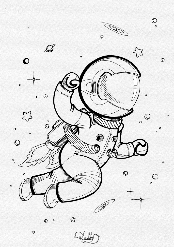
astrokid logo
I've also made this a while back. It was a logo/ graphic for an Amusement Park, if I remember correctly, that was space-themed. So naturally, it fitted me like a glove. I again stumbled upon my problem with over-doing the designs, so in the end I had to simplify it, but all in all it turned out quite nicely and the client loved it. So I'm happy when everyone is happy.
Here are a few sketches from the process...
And the finished graphic, on some mockups, 'cause I learnt how to do that and now I can't stop, just everything looks better in a mockup.
Astrokid / logo
— pen on paper / Ph & Ai editing—


Comments
Post a Comment