
primordial connection - beer label design

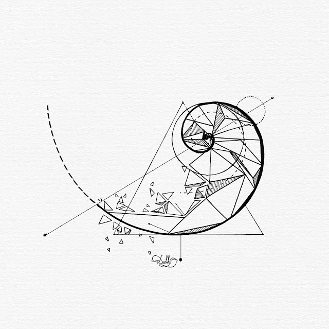
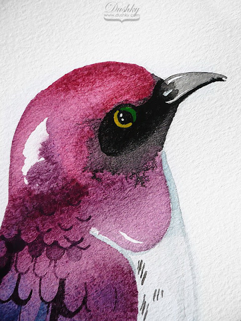
You probably are familiar with my works in terms of beer label illustration and designs, and I've been very fortunate to have so many collaborations over the years. So in that sense, here's a new label design for you. This one is more on the lines of my linear-art illustrations (see what I did there?) and it was custom-made for a one-time-only special event, a lavish wedding party. The concept was entirely the clients', it revolved around them and their story, I came up with the style and minimalistic look. Now that I look at it, I think the colours are quite the same as Pantone's colour of the year, let me look this up... *types aggressively*... from 2016. Yup, the Rose Quartz and Serenity duo. Those were a good combo. I don't remember who's idea was to use pastels for the colour palette, but the more I look at it, the more I'm into it. The end result is quite awesome, as well as was the event from what I've heard. So overall, a great success story. Cheers to the happy couple!


Also, as you can already tell, I mock-uped the hell out of this design. It just looked so good on everything. They should really consider doing some merch for this.


Comments
Post a Comment